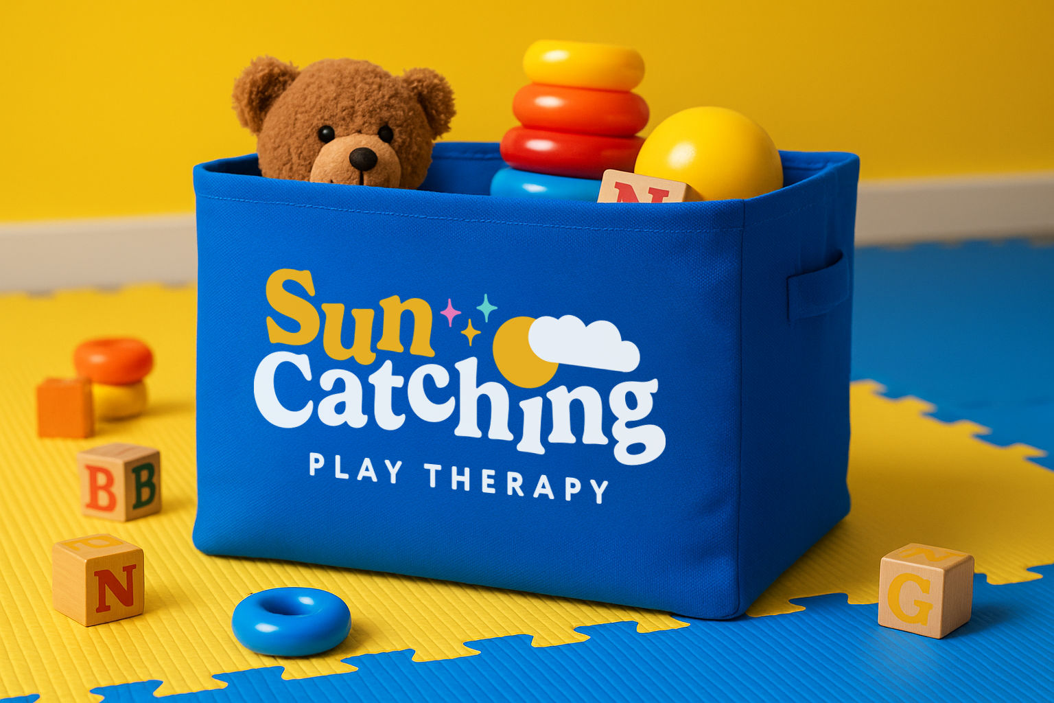
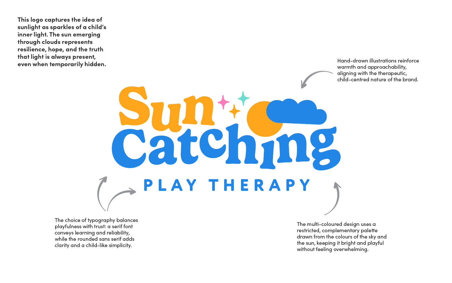
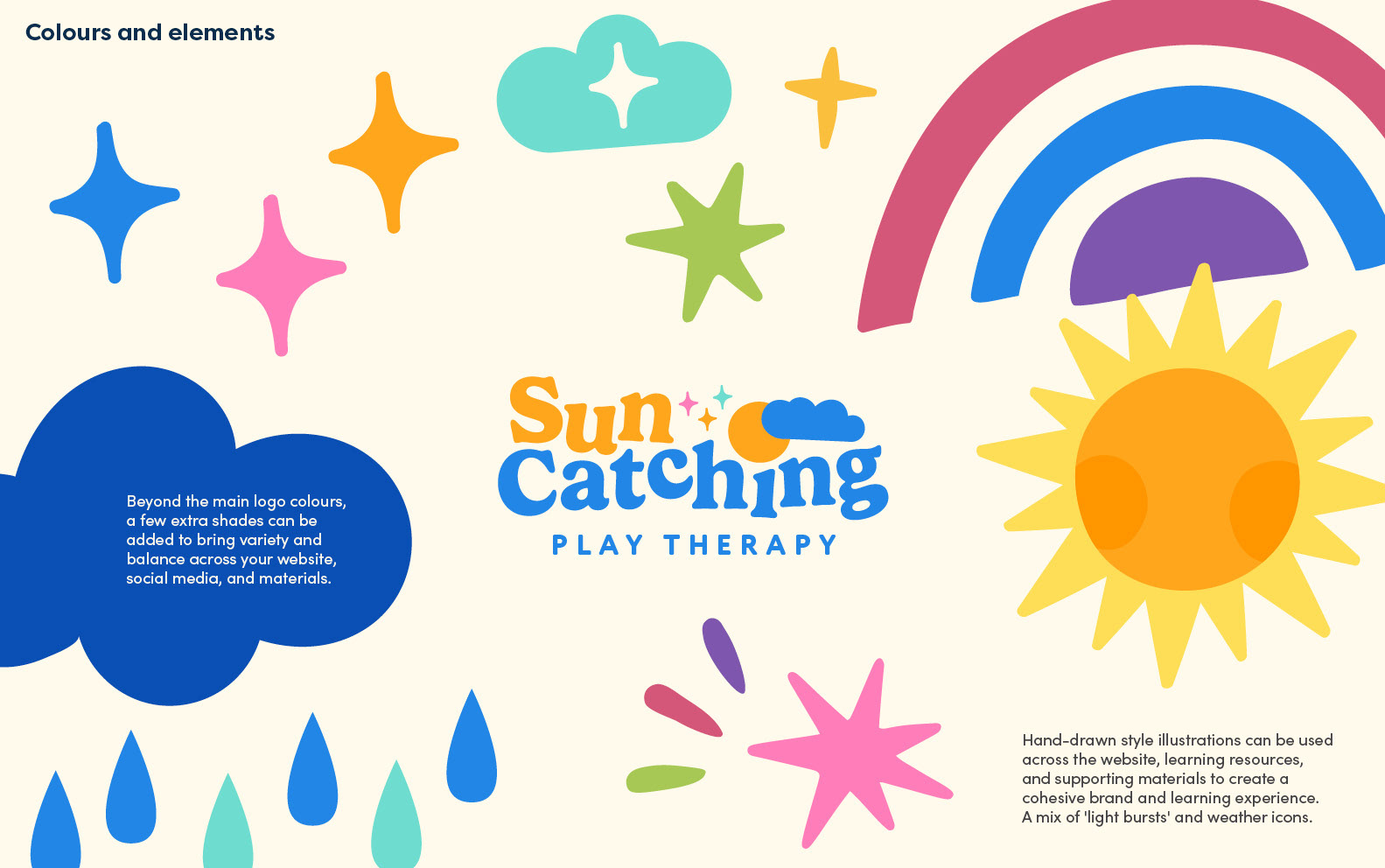
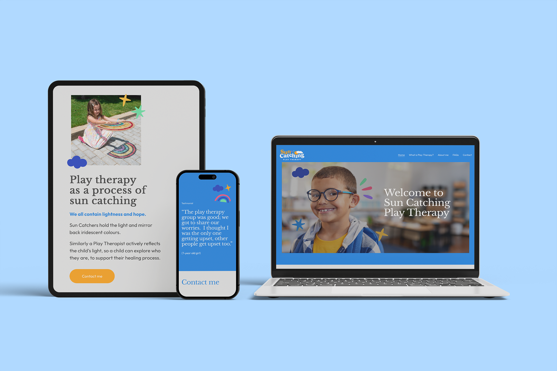
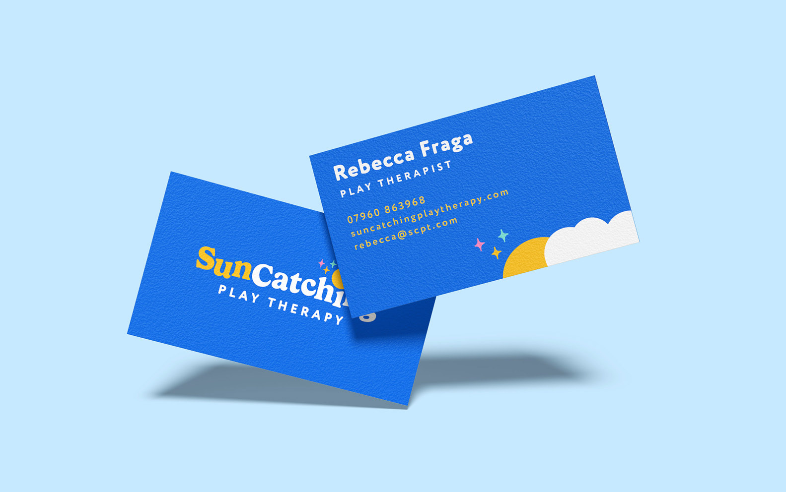
Rebecca needed a logo, colour palette and assets to help launch her new play therapy business. The concept is based on finding the sunlight within the child, symbolising warmth, growth, and the innate potential that every child carries. The identity uses bright, uplifting colours and organic hand-drawn shapes to create a welcoming, playful feel, while maintaining a sense of professionalism and trust. Supporting brand assets extend this theme with weather and sunlight inspired motifs that reflect Rebecca’s therapeutic approach — helping children feel safe, seen, and able to shine.